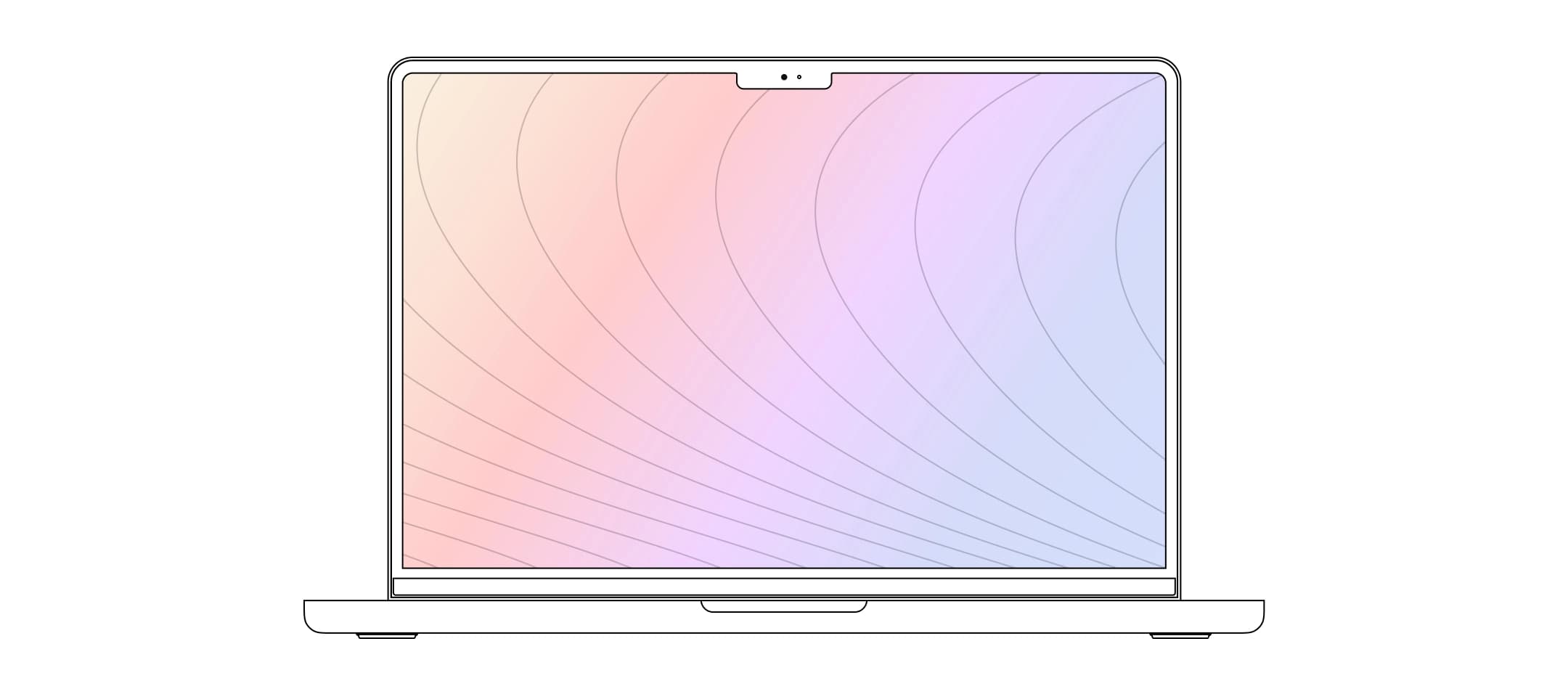
Tailor layout with className and style on the root SVG; tailor the screen with your own children.
MacbookMockup is a normal React component. You customize it in two layers:
The device frame (root <svg>) — use the built-in className and style props. Typical uses: width (w-full, max-w-3xl), max dimensions, shadows, or margins.
<MacbookMockup className="w-full max-w-3xl shadow-2xl" style={{ maxWidth: 900 }}>
  <YourScreenContent />
</MacbookMockup>
The screen contents — whatever you pass as children: Tailwind classes, your design system, images, iframes, etc. That markup is not shipped by the package; you own it completely.
The published package is MIT-licensed. For changes to the SVG paths or gradients themselves, fork or patch the upstream repo and depend on your fork, or open a contribution if the change belongs in the core library.
Docs Complete